As the saying goes, a picture is worth a thousand words. We are visual creatures, and images can be a powerful way to capture users’ attention and communicate your message. As networks and devices become more capable of displaying large images, more and more websites incorporate huge, eye-catching images. Often they can’t decide on just one image, so choose instead to display several images in a carousel.
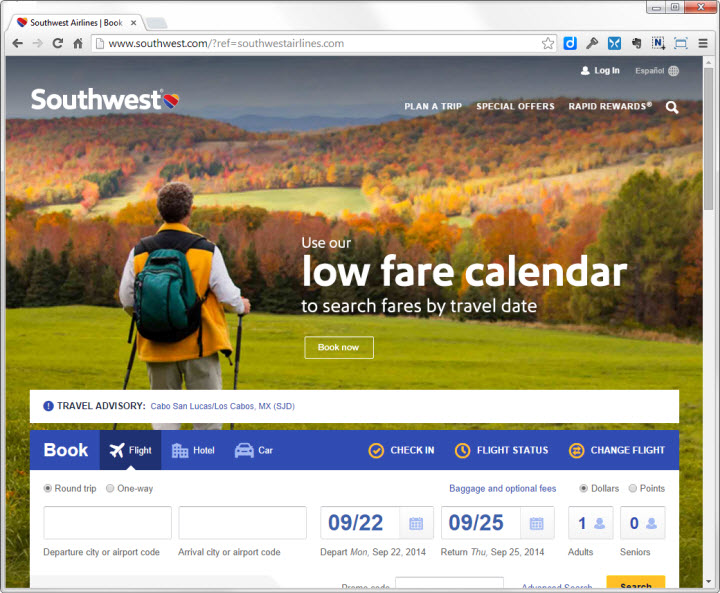
The new Southwest Airlines homepage exemplifies this trend: the focal point of the page is a beautiful landscape scene of rolling hills with fall foliage, which makes up the entire page background.
Visceral Appeal
The rationale for this approach is that compelling images have a unique ability to inspire and engage your audience. In his book, Emotional Design, Don Norman described the powerful, visceral responses people can have to visual appearance. Websites can elicit positive visceral responses from people by displaying aesthetically pleasing images – beautiful scenery, sleek products, and attractive people. (More about visceral design in our class The Human Mind and Usability.)
But visceral appeal is not the only requirement for a good user experience. Websites also need to deliver content and functionality to users.
The image on the new Southwest design is captivating, but devoting this much emphasis to any single design element necessarily means that users are less likely to notice other elements — some of which may serve more important goals.
The entire Southwest homepage is designed to focus attention on the image: the top navigation links are small and have no background color; the search function is represented with a magnifying glass icon instead of an input box, and even the Book now call to action button is an understated outline, with no background color to distinguish it from the background. Most importantly, the flight search function is pushed several inches down, so that it doesn’t interrupt the image. As a result, many users won’t even see the button to search for flights until they scroll down the page.
Comparing the new Southwest Airlines homepage to its previous design clearly illustrates the advantages and disadvantages of this approach. Like many airlines, before it was redesigned, the Southwest homepage had become cluttered with different promotions and programs. The background image was barely noticeable, because it had been so obscured with text, links, and widgets. But, the flight search tool occupied the top left corner—the first place on a web page where many users look (at least in cultures that read from left to right).

In comparison, Southwest’s mobile homepage makes it much easier to find essential content and features. The clutter has been removed, and the 4 top tasks are one tap away, as is a travel alert (though its position and the resemblance to an ad put it at risk for being overlooked due to banner blindness). This design also uses a large background image, but the action buttons have just as much visual emphasis as the image and the size of the image does not overwhelm the homepage.

When Is Image-Focused Design Appropriate?
Deciding which approach is best for your website is a matter of prioritization. In most cases a webpage has multiple goals and multiple audiences. Getting people’s attention with attractive images certainly has value, but comes at the price of making other elements harder to see and use.
The Apple homepage also features a single large image as the focal point of the screen — but this image actually shows their newest products, and is topped by a strong navigation bar providing access to all areas of the site. The image also provides useful information to the user by clearly showing the relative sizes of the two new phone models.

The homepage for Microsoft’s search engine, Bing, is another example of extreme focus on imagery, with its ever-changing backdrops. But a site devoted entirely to search has quite different design constraints that most websites. The top priority on this page is to show people the search box, and there is very little need for the design to emphasize other elements. This page works because the huge white search box does clearly stand out from the background image.

A Balanced Approach Works Best for Most Sites
Most sites will do best with a balanced approach: images that support the brand, without obscuring other important content. For example, the StateFarm homepage presents a large image representing driving, a critical part of their business. But this image is balanced by strong navigation elements and starting points for common tasks including logging in, requesting a quote, and handling insurance claims.

How to Ensure that You Use Images Appropriately
Follow these steps to make sure you have the right balance of elements:
- Identify and prioritize all the goals of the page — both the user goals, and the business goals (including brand goals.) Is the page primarily a marketing vehicle to build your brand? Or are most visitors already familiar with your organization (or at least your industry vertical), and now need specific content or functionality?
- Define how each design element relates to the page goals. Images are usually decorative, and support branding goals. Navigation and structured search relate to specific user tasks.
- Assign visual weight based on goal importance. If a design element supports a high priority goal, it should have more visual emphasis; conversely, design elements related to secondary goals should have less emphasis. (This guideline sounds obvious, but is often completely disregarded, or gets lost along the way to creating a 'modern' looking website.)
- Select images that have a strong relationship with brand goals. Remember, the purpose of your site is not just to showcase images (unless you're Flickr). Instead, the images you select should showcase the purpose of your site.
- Choose striking visuals that capture attention. Once you've identified the goals of your images and their relative importance among other design elements, and you’ve determined what types of images relate to these goals — only then should you focus on selecting the most compelling images you can find.
- Be selective about which trends you embrace when 'updating' your site. For many redesign projects, creating a site that looks 'modern' is an important goal. But there are many ways to accomplish this goal. Typography, layout, and brand colors — just to name a few—can all be effectively used to create a modern look and feel, while still providing appropriate emphasis on critical site functions.
Learn More
Our full day seminar on Top Web UX Design Guidelines explores how to identify and prioritize goals for your web pages, and the course on Web Page UX Design has more on optimal use of images.


Share this article: