To update our About Us report, we recently conducted a qualitative usability study with 20 business professionals. During this research, we observed participants’ behavior as they tried to complete key tasks related to About Us content on 40 different corporate websites.
Additionally, we asked each user to attempt a series of activities related to the Contact Us information on those sites. Our goal was to understand how people in business–to–business contexts find and interact with Contact Us pages, what information and methods they expect to see, and their motivations behind choosing a particular contact channel. In this article, we’ll share 12 guidelines for designing your Contact Us page, as gleaned from this research.
What to Include on the Contact Us Page
1. The Contact Us link should lead to complete contact details and communication options.
Your site should include a dedicated contact page with at least a phone number and email address, not just a contact form or physical address. A user looking for corporate contact information on USA.Yamaha.com grew frustrated that there was no email address or phone number displayed. He said,
“This is where I would go hoping to find that [contact] information. It is misleading to have this page called Contact Us and then the content on the page is just more paragraphs. They don’t seem to be offering other methods of contact including social media, email, or a phone number. If I go to Contact Us, I’m already expecting the variety of methods of contact.”

At a minimum, include the following information on your Contact Us page:
- Phone numbers (which connect to people who are properly trained to handle calls):
- Main contact phone number
- Customer-service number(s), if applicable
- Press-contact number, if applicable
- Investor-relations contact number, if applicable
- Other methods of contact:
- Main corporate address
- Local addresses, if applicable
- Email address(es)
- Chat, if applicable
- Social media channels, if applicable
- Fax numbers, if applicable
Beyond providing appropriate contact channels, here are a few additional best practices for displaying contact information:
- Provide the phone number and email address for a primary contact first, then list phone numbers and email addresses by department (sales, accounts, support, geographic headquarters, etc.). Just like in business–to–customer journeys, some business–to–business users prefer the phone, while others prefer email. This preference depends on the individual and the nature of the situation.
- Show contact information for local branches or physical locations. Link address(es) so they open a map application where users can get directions.
- Include hours of operation and time zones.
- Offer contact information in other languages if you serve an international, or multilingual audience.
- Tell users whether they will interact with a real person or a chatbot.
- State when associates are available to take calls, exact or average wait times, or approximations for the time it will take to receive an email response back.
One user on UBreakIFix.com said she valued having contact information for local stores. She said, “I would try by phone call first, probably a local store. If I can’t find it myself, I’ll call corporate.” The user appreciated that the site included both a clear link to locations in the navigation and the corporate phone number.

While searching for contact information on the Small Business Administration’s website, one user was impressed by the fact that the organization offered full contact information in both English and Spanish. He said, “It’s nice that there’s Spanish contacts. You don’t always see that; I can call a phone number. I don’t always see that either, it’s very nice.”

Display Contact Us Information Where Users Expect It
2. Include a noticeable link to Contact Us in your main navigation or utility navigation and in the footer.
Our usability testing and eyetracking research show that, if you ask users to find the Contact Us page on a website, they will look in the top right corner of the page or down in the footer. Companies that hide or don’t provide prominent links to Contact Us information are seen as evasive and unreliable.
This guideline may seem obvious to seasoned UX practitioners, but surprisingly many sites still fail to include a Contact Us link in at least one of these key areas. In some cases, organizations will label their Contact Us page as Resources or Help Center, but we advise against this practice. When we asked users to reach the company to get an answer to a question, they looked for the label, Contact Us.
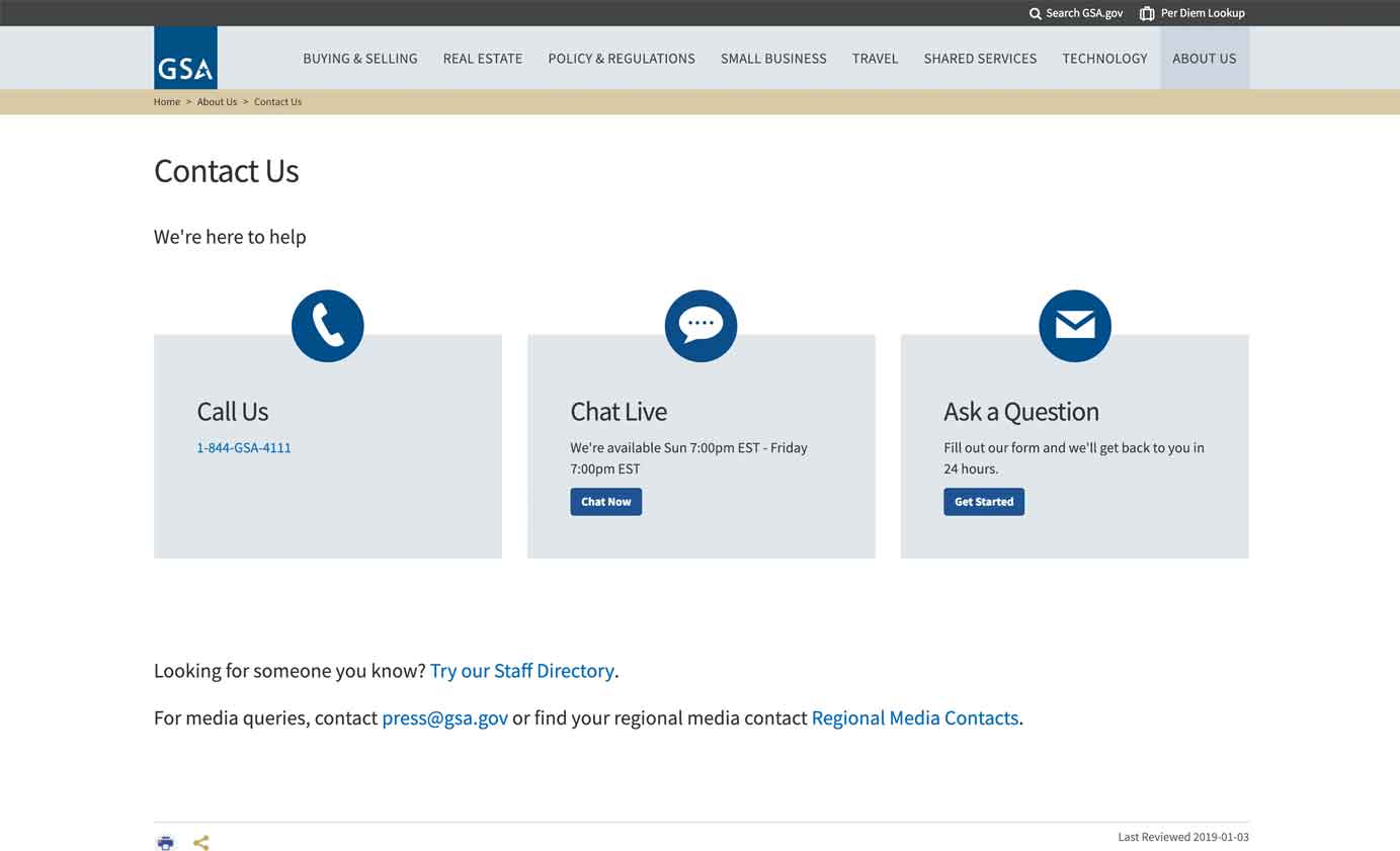
Though many of the websites we tested provided clear links to contact information, a few made it particularly difficult to get in touch. For example, one user on the U.S. General Services Administration’s website struggled to find contact information, as it was hidden in a dropdown menu, underneath the About Us link in the main navigation. The user finally found it, but wished it had been easier. She said, “I would have liked to have Contact Us up in the top, rather than going to About Us. Once I scrolled down to the footer, I saw it, but it could have been easier to find.”
Don’t hide Contact Us links behind your About Us label in the navigation; instead prominently feature contact information in the header and footer of your website. (It can be appropriate to include contact info on an About page, as long as it’s a supplement to the main Contact Us link.)


Never Hide or Remove Phone Numbers from the Contact Us Page
3. Clearly display contact phone numbers on your site. Don’t hide or remove phone numbers.
Displaying a phone number shows that your organization cares about its users and wants to be available. Not displaying phone numbers implies that the organization doesn’t want to be bothered. By giving people ways to directly reach your organization, you ease fears, appear reliable, and build trust.
However, companies often want people to self-serve or refer to the website for answers, instead of contacting the organization directly. Cost per call, volumes of calls, and response times are all metrics which often get measured and scrutinized to the point where stakeholders decide to remove the Contact Us phone numbers altogether in an effort to keep costs low. (A better approach is to invest in basic website information architecture and content usability so that answers to customers’ main questions are easy to find and easy to understand.)
Though hiding phone numbers may seem like a cost-savings measure, doing so will cause much damage to a company’s reputation. The majority of users in our study said they prefer talking to a real person on the phone to get questions answered, rather than emailing, filling out a form, or chatting. When matters were not time-sensitive or when users couldn’t pick up the phone, they emailed or used live chat. One person said,
“There are companies that don’t even give you a phone number anymore. I don’t like it at all. What if my message gets lost? It makes them seem suspicious to me, I want to talk to someone on the phone.”
Users on GiftTree.com and OneCall.com liked that the organization’s 800-numbers and email addresses were easily accessible. Another user said, “It’s good that the 800-number is on top, with a link to Contact. There are a lot of places where you can get a hold of them if you want to — which is good.”


4. For sites with many contact phone numbers, organize them into clearly labeled groups to help users find the right phone number.
Large organizations tend to have hundreds of contact phone numbers, resulting in a swath of complex options. If presented as an unorganized list, phone numbers will be completely meaningless to people and they won’t know which one to choose. Organizing contact numbers based on your company’s internal structure usually backfires because outsiders won’t understand your hierarchy or organization chart. Additionally, sites with complex contact page elements — such as extensive dropdowns and department categories — are overwhelming.
If you have a complex company structure, provide a main phone number on the Contact Us page to alleviate any confusion people have about how to contact you. Multiple contact listings should be grouped and labeled clearly so that users know exactly which to choose. For example, Chevron’s Contact Us page did a nice job of displaying a main phone number, along with a link to specific phone numbers for various departments.
Display Your Company’s Address on Contact Us Pages
5. Always include your headquarters address in your contact information, including the state/province and ZIP.
Sharing your physical address is important because users often rely on the Contact Us section to find out where a company is headquartered. Displaying your address also increases the probability that users will find your company’s website when searching for local results via search engines. Users often enter a combined query that includes keywords for both the desired product or service and their location. For example, somebody looking for a dentist in Salem, New Hampshire is likely to use a keyword like dentist Salem or dentist Salem, NH. Your site won’t show up in search-results pages unless the search-engine robots can determine that your dentist office is in Salem, NH.
6. If you serve multiple countries or an international audience, provide contact information for each office location abroad.
To show consideration for your international audiences and users who need information about an office abroad, provide contact information for all of your global locations, not just your headquarters. People may need to find the address of an office location in another country or they may need to call an international office directly, rather than calling your headquarters. Include the physical address, an email address, and an international phone number (with the country code), for your office locations abroad.
For example, Chevron included a gateway page on its site, with links to contact information for all of its international offices. Users selected an international office and were taken to a specific page detailing how to get in contact with someone there.
Don’t Block or Slow Users Down from Getting in Contact
7. Offer a contact form only in addition to telephone numbers, not as a replacement.
People have concerns about committing to contact forms and see them as barriers to productivity. Users are also skeptical of forms since they’re often used to capture email addresses for marketing purposes. When users filled out contact forms, they felt like they were relinquishing control of the interaction to the company rather than retaining it themselves. They wondered when their inquiry would be addressed and whether it will ever be answered at all. For example, Slack.com’s users were annoyed that they had to fill out a form to ask a simple question.
“I don’t like that you have to fill out this form, considering all you want to do is talk to them. I hate when you go to a link and have to provide a bunch of information to get in contact. I am hesitant to put my email into a website — that is the last thing that I would do.”

Melissa and Doug, on the other hand, offered a myriad of helpful contact options, including a form. It also had specific email addresses for various business units and presented users with all its international phone numbers right on the Contact Us page. One user who was evaluating a position with the company said, “It’s nice that they give you many different phone numbers, live chat, email options through this form — however you like to communicate, you can do it.”

8. If you include a form on your Contact Us page, limit it to 3–5 fields and ask only for information that’s needed to respond back.
Ask people to provide their name, preferred method of contact, and a brief description of the question or issue. If your form requires more fields for specific reasons, know that users may not complete the form, which could result in lost leads, sales, or talent.
The contact form on the American Refugee Committee’s website had only a few fields. While it asked for some personal information (i.e., name and email), the fields were relevant and not too restrictive, as people could choose to enter their full name or not.

9. Don’t force people to create an account to contact your company.
People don’t want to spend time creating an account with your company if all they need is an answer to a simple question. In addition, users worry about being inundated with spam and email, so they may avoid creating an account and contacting you entirely. For these reasons, don’t require users to create an account to get in contact with you.
While learning about Adobe’s offerings, a study participant tried to contact the organization. She grew irritated when she had to first sign in to an account to contact the organization. She said, “I wish when I hit Contact, that I could just get an email address or a phone number, instead of having to sign in. I’d have to create an account.”

If Available and Reliable, Include Chat and Social Media Channels on Contact Us Pages
10. It’s good to have online chat as a contact option, but it should not be the only contact method available.
Thoroughly test chat with your users to understand if it meets their expectations and when they prefer using chat over other contact channels. Chat should be available, but not popping up at the wrong times or popping up without the user initiating the interaction. Our research participants had mixed feelings about using online chat — particularly because of bad past experiences with poorly implemented chatbots.
However, some people spoke favorably about chat when the site clearly indicated whether the chat agent was a real person or a bot. Users who preferred chat over picking up the phone mentioned not having to sit on hold as the main reason for their preference. A GoToMeeting user exclaimed, “Love the chat option; they know what they’re doing, without having to sit on hold forever. I like if a copy of the chat can be emailed to me, or I’ll screenshot it on my phone. I prefer the chat.”
Another user on the General Services Administration’s website said, “It’s good that they have the phone number and live chat. Since this is a government website, I would feel better about chat because if you call, they will take you to 500 different people and keep transferring you. I don’t have time to wait for an email back.”
11. Display social media channels as contact options only if these channels are staffed with properly trained professionals who can respond to inquiries in a timely fashion.
Many people in our study mentioned using a company’s social media channels to ask questions or resolve issues. For example, one user spoke highly of an internet service provider that responded immediately to his question on Twitter. He described getting very slow connection speeds, so he mentioned the company in a Tweet. Within minutes, he got a productive response. He said, “That’s one of the first times I’ve used Twitter and social media to reach out to a company, but that’s where things are going and it worked.”
UBreakIFix.com offered options for contacting the company via social media channels. These options were presented on its Contact Us page and provided direct links to each channel. It’s important to mention, however, that not all users will be comfortable contacting your company via social media, nor do all users have accounts on those channels. For these reasons, it’s still important to include other methods of contact, such as a phone number, email address, and chat.

Tell Users When You’re Available and When to Expect a Reply
12. For each contact channel, communicate availability, wait times, and response windows on your Contact Us page.
Tell people when certain channels are available, when to expect a response, and how long they will wait if they call, chat, or email. Most users expect an email or response to a form submission within 24 hours, and usually don’t want to wait longer than a few minutes on the phone or chat. When displaying availability timeframes, include specific times and time zones, and make sure you live up to the response timeframes stated. For example, GSA stated that it would respond via email within 24-hours on its Contact Us page and provided hours of operation for its online chat. To improve even further, it should include hours of operation near the phone number as well.
Conclusion
People decide how to get in contact with a company, based on a variety of factors. Their scenario, the amount of time they have, a channel’s perceived reliability, their current context, and comfort level with certain methods of contact all influence the choice. Never hide, remove, or replace contact information in favor of automated methods such as online chat or Contact Us forms. Always include the company’s addresses, phone numbers, and email addresses on Contact Us pages, as users still expect to find traditional methods of getting in contact.
Even more guidelines for the design of effective Contact Us pages can be found in our full report on Presenting Company Information on Corporate Websites and in About Us Sections.


Share this article: