For most websites and apps, visitors go through a long dating process, not a one-night stand: they rarely convert after the first visit. Most commonly, the first visit is used to gauge credibility. Subsequent visits may involve more complex interactions and, possibly, conversion events, which may happen weeks or months after the initial visit. Thus, to better support our users, we need to understand the actual dating process for our site visitors. Do people use our site every day or even multiple times per day? How many visits precede that final conversion? Does this behavior fluctuate based on the time of year?
Analytics tools help you answer these questions and can inform decisions regarding content strategy, schedules for marketing emails and promotions, or whether to design mostly for novice first-time visitors or for expert frequent visitors.
Definition: Frequency of site visits indicates the overall number of visits made by each user on your site. This metric allows you to assess the percentage of new users on the site as well as the familiarity level of all returning users.
Definition: Recency measures the number of days that have passed since each user’s last visit. This measure allows you to see the average amount of time between visits for your user base.
Combined, frequency and recency measure how “sticky” a website or app is — do people return regularly to it or not? Analyzing the behaviors of loyal customers can lead to valuable insights — for example, you may find pages or tools used frequently by returning users, but ignored by occasional visitors (particularly “siteseers” who only visit once). When you uncover such trends, you can then adjust the design of the site to increase the discoverability of those features that your repeat users find valuable.
Frequency: How Many Visits?
When using analytics tools such as Google Analytics or Adobe Analytics, frequency is described by a histogram of the number of visits. (A histogram is a type of bar chart in which each bar shows the number of data points that have a certain value or fall inside a range of values.) In Google Analytics, this histogram is called the count-of-session report and in Adobe Analytics it is the visit-number report.
Rather than merely measuring whether users are new or returning, such reports allow us to more precisely understand the familiarity level of users: how many of the visitors are highly familiar with the site (say, have had their 6th visit or more) versus how many are relatively fresh to the site?
Count-of-session (or visit-number) reports are usually defined for a specific period of time T (e.g., August) and they tell us, for each possible number of visits (i.e., count of sessions) n, how many users have had their nth visit within the time period T. So, for example, for count of sessions n=2 and the month of August, the histogram would tell you how many users had their second visit in August. (Note that some of these users may have had their first visit before August and some may have had it in August — they are all included in the count of sessions for n=2, as analytics tools report visit number as a lifetime value for each user.)
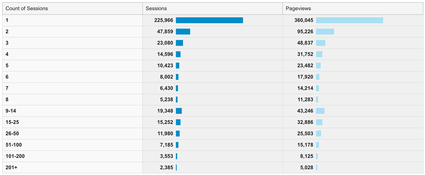
A user may be included in several count-of-sessions bins: for example, users who had their first two visits in August would be included in both the count of sessions for n=1 and the one for n=2. If there were many more new visitors than returning, you’d expect the first bar (for n=1) to be a lot bigger than the others.
In order to get more detailed data about a particular category of users, we need to create a special segment (a subset of the data obtained by applying a chosen filter). For example, to see the frequency graph for those users who visited only one time in a given month, we would specify the rule “Sessions =1” as a filter to create a segment.
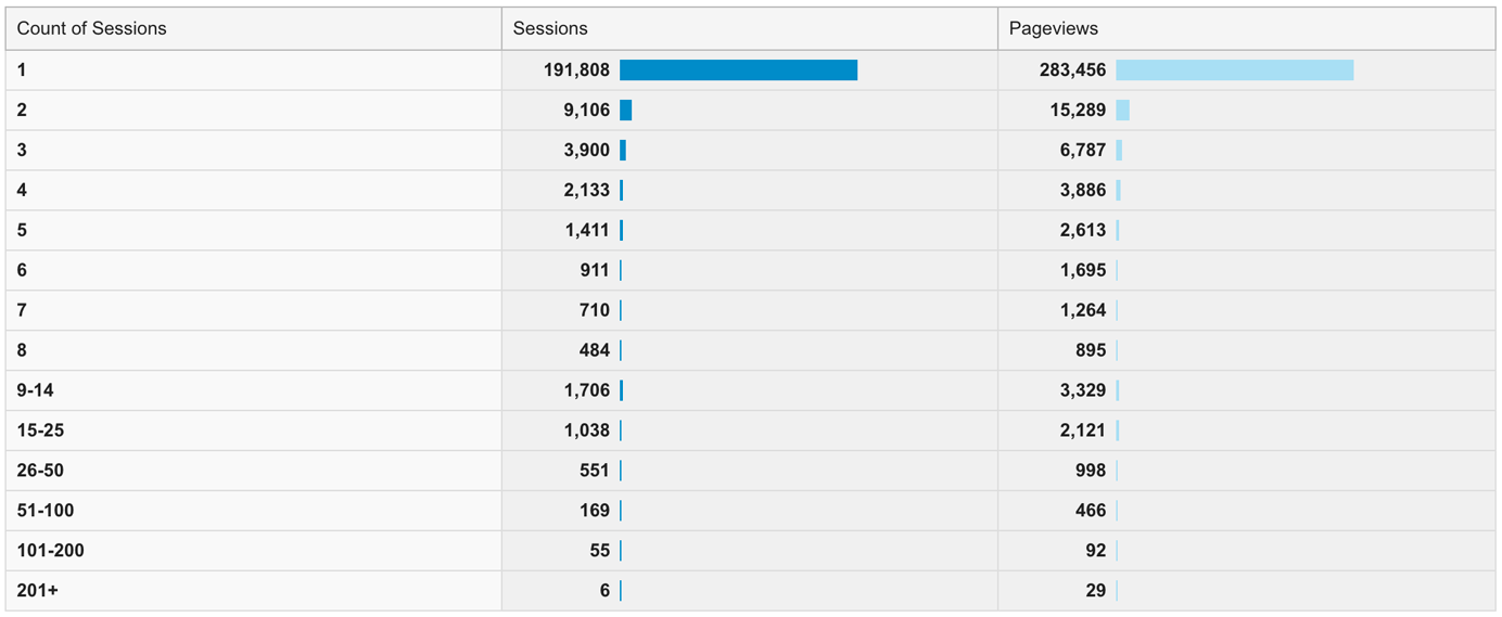
In isolation, looking at a frequency report does not reveal much because the rows generally just decrease in number as the count increments (not particularly surprising — as you increase the loyalty level, you can expect fewer and fewer users at that level). The real value emerges from looking at the segment of visits where important events (such as conversions for a certain goal) occurred and determining how many other visits preceded the event of interest.
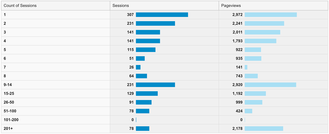
By uncovering the typical number of visits a user has had before converting, we can better design for our users’ actual journeys. For example, if the majority of conversions occur on a users’ 5th or 6th visit, we can implement tools to remind people what they were doing in the past to help them pick up where they left off, email users with only 3 or 4 visits to persuade them to revisit the site, and so on. We could also plan a usability study or diary study to learn what the barriers to conversion may be: perhaps it takes so many visits to convert because users have difficulty comparing our offerings to those of competitors, or because they believe it will take too long to sign up and get started.
Recency: When Did People Last Visit?
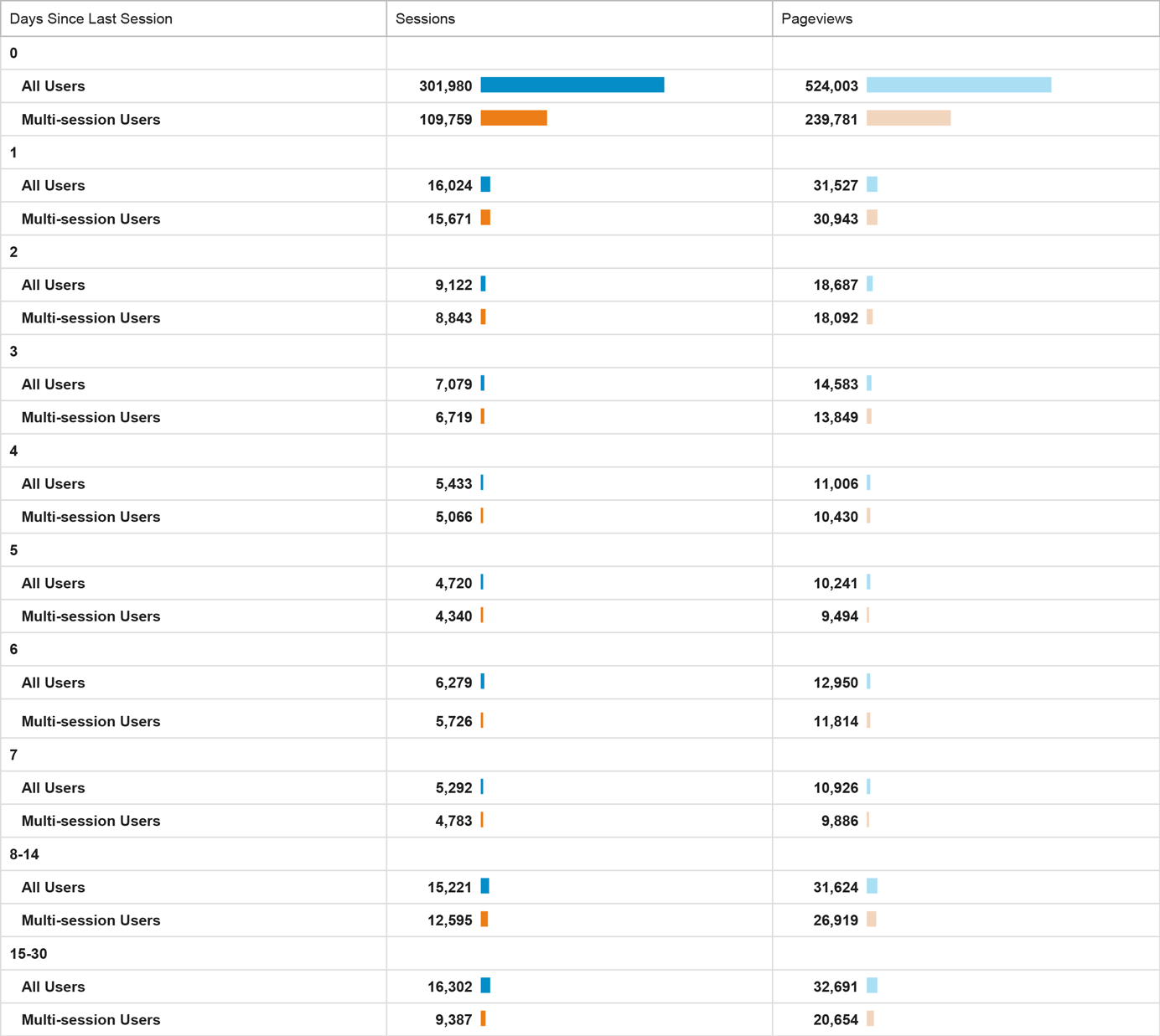
To measure recency, analytics tools report the number of days that have passed since each user’s previous visit.
In Google Analytics, for users who are new, the recency value (Days Since Last Session) is recorded as 0 days —the same as for users who have visited twice (or more) during the same day. Thus, when looking at Google Analytics recency reports, it is helpful to filter new users out by applying a segment including only multisession users. In Adobe Analytics, the return-frequency report already excludes first-time visitors. (Other tools may report this type of data using either method, so be sure to check how your analytics tool functions.)
Recency data helps uncover how regularly people tend to visit, compared to how frequently content or promotions are updated. If your content strategy were to change, would the rate between visits also change? Is it worthwhile to design a new banner image every day, if most users only visit once every few weeks? (Hint: no.) On the other hand, if you see a spike in the visitation rate each time your site pushes new content, it may make sense to increase the frequency of your updates.
For example, in the screenshot above, we can see that most multi-session users return to the site within the same day as the previous visit (the longest bar is the one in the row Days Since Last Session = 0) or just 1 day later. Notice also a small bump at the Days Since Last Session = 6. In this case, the bump corresponds to a weekly email newsletter.
Segments can help uncover desirable usage patterns — in particular, those of frequent visitors vs. those of occasional visitors. If people who return every day or every other day tend to convert more, whereas less frequent visitors end up never converting, then you should investigate what other behaviors are different between the two groups. Is there a feature or tool that more-engaged visitors use and that you could make more discoverable for everybody? Are frequent visits triggered by certain email promotions? Do frequent visitors have a different experience due to being kept logged in to the system? Different times of year can also be compared to uncover usage trends based on seasonality or specific marketing efforts.
Recency data also helps you make sense of the frequency data, to better understand when people return to the site. For example, if your count-of-sessions report shows a large number of users coming to the site 3–4 times, you can create a segment for that group and see if those visits occur within 0–1 days or over the course of a few weeks.
Conclusion
Frequency and recency data are helpful to better understand the customer journey of your users, as well as their needs and behaviors. They can help create or maintain your personas, and also discover how to better support not only your visitors, but also your business goals. How many times do people visit before they finally convert or take some other desirable action? Do those visits occur within a short time frame or are there large gaps between sessions? Such knowledge can be used to turn visitors into valuable, engaged users.
Learn more about using analytics data for UX insights in our full-day training course on Analytics and User Experience.


Share this article: